Virtual Assistant UI main Dashboard
With this design, there are a couple of things that I wanted to make it as easy as possible for the agent using the mobile app:
- See progress of their tasks
- Creating new tasks as easy and fast as possible
- Talking to advisors regarding their tasks
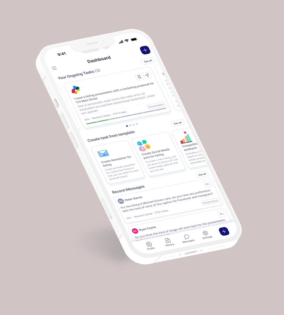
I envision this page to be the first thing that the agent will see when they open the app:The first section will be for Ongoing Tasks:
- Agents will give the task a title and a short description of what they want done.
- The graphic on top of the title will depend on what kind of task it is (presentation, CMA, social media posts, newsletter, etc). The graphic is there so that everything will be glance-able for the agent and they will know right away what kind of tasks they have in queue
- This section will be horizontally scrollable so that the agent can easily swipe through their ongoing tasks.
- They can see percentage progress of their tasks, as well as ETD (estimated time of delivery) of how long that task will particularly take. if we just show the progress and no end in time, the agent will not know if it is 50% of 1 day or 1 week
- We also have 2 buttons in each card:
- Pinning the task if its important to the agent, and they want to see all the time
- messaging the advisor working on their task
The second section will be for Creating Tasks from a Template
- Instead of making our agents THINK of what they need, we show them templates of what we can actually do for them. This subtracts the amount of time they have to do on the app and focus on the things they do outside of it.
- Once we have enough data from Beta to know what agents actually ask for help most of the time, we can create templates for this section so that we can prepare the tools for advisors for them.
Third section will be for Recent Messages
- There will be back and forth between Agents and Advisors when it comes to tasks so I opted to add a section where those messages are easily seen by the agent right away when the use the app.
- The Agent will also be able to reply right away to the particular message when they they click on the reply icon on the card.
This UX and design leans toward a very pragmatic kind of interface where we just want the Agent to:
- See update of their tasks
- Create new tasks
- Talk to advisors